Signs for Science was a collaboration between myself and some designer friends in NYC—Katie Chin, Yonji Kim, and Juan Prado. A labor of love, and a creative brief for something that matters.

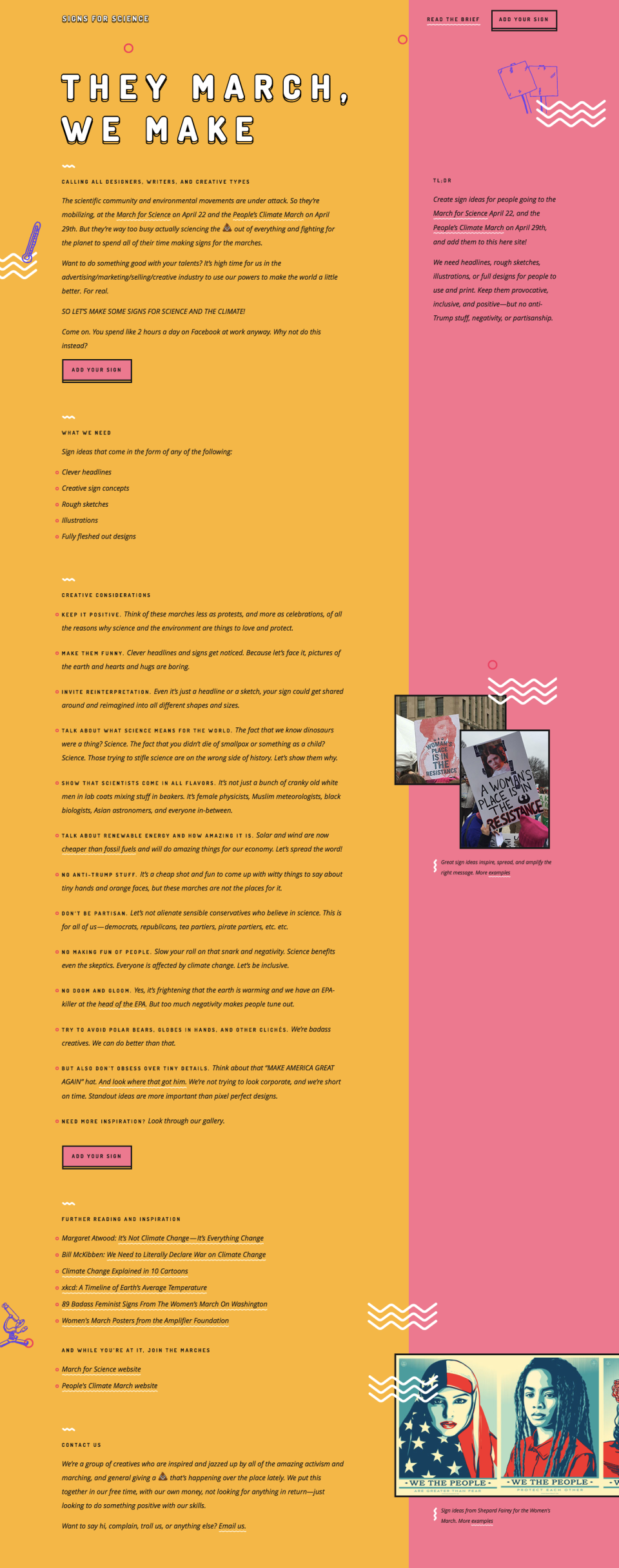
The goal of the project was to get fellow designers, copywriters, comedians, illustrators, and other creative types in the ad/marketing/design/startup worlds to create & share great sign ideas about science & climate change. The signs would then provide inspiration and ammunition for activists to use at the March for Science and People’s Climate March in April 2017.
The initial spark came after hearing politically active scientists talking about their involvement in the run up to these marches. They were concerned that the huge movements which grew and expanded rapidly out of the Trump administration’s hostility towards science were going to be seen as too partisan or elitist, hurting the cause in the long term.
We saw what happened at the Women’s March in January. A massive movement, with millions of people marching nationwide, a great show of resistance―but not solidarity. You’d see just as many signs with Trump jokes or climate change messaging as you would signs actually celebrating women.
As concerned citizens looking to put our own talents towards doing good, we wanted to contribute to the creative energy at the science and climate marches, making sure the right message got across. A more focused, targeted, and positive message, that would still grab headlines.
The idea started as a simple creative brief that was just going to be an email or something to set the stage, lay out the problem, and provide guidelines and inspiration, sent around to friends and colleagues in the industry. Eventually, it expanded into a full on working website project.
First we listed out a bunch of possible features in a Google doc, divided up into MVPs and nice-to-haves. Then we got to wireframing.
We put together mood boards to explore the vibe. A mix of fun, high design, and sciencey.
An important goal for the site experience was to make sure it was easy for people who weren’t designers to submit sign ideas. So we created a submission flow with options to upload an image if you’re a designer, or type a stylized slogan if you’re a copywriter or non-designer.
We wanted to make sure that these text-only ideas still stood out nicely in the gallery alongside the submitted images, So we chose an expressive handwritten font for them to display in, and built the entry page to show the text filling out the sign space dynamically as the user typed.
In the spirit of getting as many ideas generated as possible, as quickly as possible, we also decided not to do a submit/approval process. We would let signs show up right away, and remove any offending ones if necessary after the fact. We did end up with a few trolls―always the sign that you’re doing SOMETHING right!
Another vital aspect was making sure that our “brief” came across loud and clear. The About page acted as that brief, and the place for detailed guidelines and do’s/don’t’s for sign ideas. But we knew not everyone would visit the About page so we made sure to sprinkle the most important guidelines throughout the entire experience with microcopy in the CTAs, form entry fields, and callouts placed throughout the gallery.
While designing and coding the site, we created some example sign ideas and reached out to friends to gather a decent array of signs for launch. We also put together a little pitch deck in Keynote to send around and gather ideas.
Overall we went from discussing the idea over lunch, to wireframes, visual designs, front-end and back-end dev, and launch, in less than a month, on nights and weekends and wherever we could spare the time.
Thankfully the word spread pretty fast! We reached out on Twitter to all of the satellite science marches in cities around the globe. Designer and advertising-centric Facebook groups also played a big part, and a massive push from the March for Science Facebook group with over 800k people.
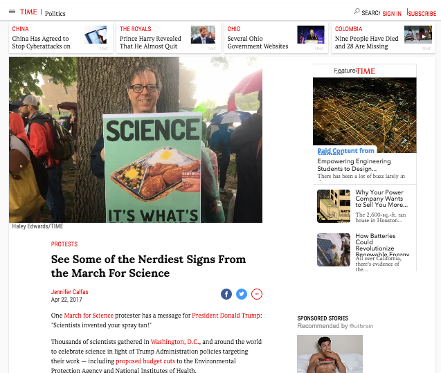
In the end we got over 300 sign submissions, and even got to see some of our signs show up in the spotlight—everywhere from Muzli to time.com and randomly in Lana Del Rey’s Instagram feed!

Credits:
Concept, content strategy, UX & copywriting: Jesse Mann
Visual design, UX & front end dev: Katie Chin
Front & back end dev: Juan Prado
Illustrations & visual design: Yonji Kim


